There are two routes that you can use to make a calendar grid in PS. You can make one using Microsoft Excel, save it as a pdf file with a PDF Writer like Ghostscript, and then open it with PS and use it as you need. Or you can simply use your line tool in PS to make a grid and use that as you need for your calendar. For example purposes I am leaving off a spot in the grid for the month...I figure that can be added creatively later!! Here is the tutorial for making it in Microsoft Excel first(scroll down for version 2):I was able to use PDF Writer (Ghostscript) to convert my Excel file into a pdf. PSE and CS are both able to open and manipulate pdf files. I find this software through my print screen when I go to print. I will have to check with my DH to see how we got this software on our computer, but I am pretty sure that it was a free download. Anyway, when you go to File>Print then a screen comes up that gives you an option of choosing where to print to. I select PDF Writer (Ghostscript) in place of my printer and it prints it to a pdf file on my desktop...you are able to save it somewhere else when you save it. This is probably the EASIEST way to convert it to workable in PSE or CS. It does print it a brown shade, but that is easy to fix in PS.
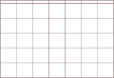
For the example grid above, I highlighted 7 cells across by 6 cells down. Then I right clicked and selected format cells. Next put a border around the cells. I left a blank borderless row of cells on the top so there would be room for the name of the Month. Depending on what you want to do with the days of the week you may not need 6 bordered cells down, just 5 will do, but be sure to leave room for you to add them if you want to.
Here is how I set up my example: The first row of cells(blank for the month) I put at a row height of 40. The next row (first bordered-for the days of the week) I put at the typical row height of 12.75...you may want to play with that depending on fonts. The last 5 rows (for the calendar body itself) I put at a row height of 66. Then all 7 of the columns are at a column width of 12.
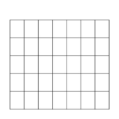
I did add a little more decorative border around the days of the week row and the whole outside...but you can play with the borders as you like in your own. Also, If you like mine enough...you can go ahead and use it. Just right click and select Open with Adobe Photoshop....etc. Hope this helps you. Let me know if you have any other questions. And now for version 2...how to make a grid in PS (whichever version you have):My example this time is a 12x12 one, open a new 12x12 file, white background, and 300ppi. Next click on your line tool to make sure that is the tool you are using. Next, if you don't have the grid showing, go to View and click on Grid so that a checkmark shows up next to it. While you are in there make sure that Rulers also has a checkmark next to it.
Now for the example above this is what I did...
In the top option bar for the line tool click on the weight box and type in a weight of 10 px. (This sets how wide your line will be.) Now click on the calendar screen to set it and it will give you a plus sign in place of an arrow. Place the plus sign at 1" on the top ruler and 2" on the side ruler using the grid to line it up. Click and Drag while pressing Shift until the "plus" sign lines up with the 11" mark on the top ruler and then let go. This will give you your top line. Now do the exact same thing only move down to the 11" mark on the side ruler, again click-shift and drag it from the 1" mark to the 11" mark on the top ruler. This gives you your bottom line.
Most calendars have at the most a need for 5 rows down for the body of the calendar...with just a few exceptions (that is when they add a slash through the the bottom rows first one or two "boxes"), but you can decide if you prefer another row or to slash them. For my example I am just sticking with the 5 rows and no slashes as this will be fine for majority of the time.
So, the next step is to right click on either the top line layer or the bottom line layer and duplicate layer...do this over again until you have duplicated it 4 times. This will give you a total of 6 lines. Click on the move tool, and uncheck Auto Select Layer. (Make sure to recheck this when you are done.) Now move the 4 duplicate line layers so that they are space out...IT DOESN'T HAVE TO BE PERFECTLY SPACED!!...just make sure that they are between the top and bottom lines. Now click on the top of the line layers in the stack to highlight it in the layer palette, then hold down shift and click on the bottom of the line layers in the stack. This will highlight all of your line layers. While still on the move tool, go Distribute on the top tool option bar. Click on Vertical Centers. This is really COOL!! It will perfectly space your lines for you!!
Now, while they are all still highlighted, is the time that if your lines got a little out of line...LOL!...then you can line them up. Go to Align, and Horizontal Centers. You should find that you now have all of the horizontal lines you need for your calendar, and they are spaced just right. The next steps are easy, you basically are doing the same thing only dragging from top to bottom instead of from left to right. And you will need more duplicate line layers as there are 7 days in a week, meaning you need 7 columns. So, here goes...Go back to the line tool and place the "plus" sign back on 2" on the side ruler and 1" on the top ruler. Click-Shift, and Drag it down to 11" on the side ruler and then let go. Again, using your grid helps. Now you have your left grid line and your grid is starting to look more like a box or grid then just a bunch of lines. Place your your plus sign at 11" on the top ruler, and 2" on the side ruler. Do the same thing: Click-Shift, and Drag your line down to the 11" mark on the side ruler. This gives you your right grid line. You are ready for Duplication. This time you want 6 Duplicate line layers. Space them apart, again NOT PERFECTLY. Click the move tool, Distribute, and this time you want Horizontal Centers. Again, while highlighted still, if needed you can go to Align and this time pick Vertical Centers.
You should now see a very nicely spaced grid. However, if you are picky like me, you might be looking at the corners of your grid and saying...WHY AREN"T THEY MATCHED UP??? Well, not to fear...mine didn't either. So, now for the final touches.
 You should still be on the move tool...if not, click on it. Now I want you to simplify/rasterize all of the vertical line layers (if you are like me...LOL!...that means the ones from top to bottom!). Highlight all of the simplified/rasterized layers in your layer palette and watch for the transform box. Then I made the lines much longer by using the "mini" boxes on the top and bottom in the center. (Let me know if I lost you there!) This doesn't change the width of your lines so it still looks fine.
 The final step is to take your Rectangular Marque tool and select a rectangular area around the extra pieces of vertical line on the top of the grid, click on each of the vertical line layers in turn and hit the delete button on your keyboard. Now do the same thing only select a rectangular area around the extra on the bottom of the grid.
This should make it so that when you are done your grid now looks like a box with smaller boxes inside...or a GRID! Now pat yourself on the back...you have a calendar grid perfect for making your family calendars!!
I didn't leave much room for Decorating, just for adding Month and Days, in my example. But you can easily resize your grid to a smaller size for you to have embellishing room. One other option for making it a bit more decorative is to do the same thing as described above, only with the brush tool. If you like the dashed or dotted line look this might work better for you. Just be sure to hold shift so your lines are straight, skip the simplify/rasterize steps, and create a new layer everytime you draw a new line. That will make it easier to play later with matched up corners and edges. Hope this helps you! If you have any questions or I just simply lost you let me know and I will do my best to answer the questions and reword the step I lost you on.
Now for the FREEBIE!!!! I went and made some calendar grid brushes...both landscape and portrait directions for an 8.5x11, and then my 12x12. You can get them by clicking here. Enjoy!!


 This weeks challenge is about making those dreaded gift lists...and making it FUN to check them twice!! Here's an idea...how about scrapbooking them!! More on this in the Challenge forum!! Come share fun family gifting traditions with us!!


 (This will only be a freebie on my blog for one week...then it will be able to be found in my store at Digiscrapstation.com .)